DESIGN TRENDS - CLASSIC BLUE by Cristina Morozzi
Classic blue, identified as the colour of the year for 2020 by the Pantone Colour Institute, signifies more than just a trend; it embodies a rich history and nuanced meanings that have evolved over centuries. Established in 1950, the Institute plays a pivotal role in the global colour conversation, bringing together international experts for biannual meetings in European capitals. During these events, specialists engage in rigorous discussions, ultimately selecting a color that resonates with the cultural and emotional climate of the time.

Michel Pastoureau, a leading expert on colour, historian, and anthropologist, states: “Colours are not trivial; they carry codes, taboos, and prejudices that we unconsciously follow, with hidden meanings that can deeply influence our environment, development, language, and imagination. " Since the 12th century, blue has symbolised the Virgin’s mantle in art, gaining divine status and the ability to influence the economy.
In “History of a Colour “(ibidem 2002), which is richly illustrated, Pastoureau emphasises the triumph of blue in the modern era and explores its significant meanings. Fashion embraced the classic blue with enthusiasm, making it the dominant colour in runway shows by brands like Marni, Valentino, Balenciaga, Heider, and Ackerman.

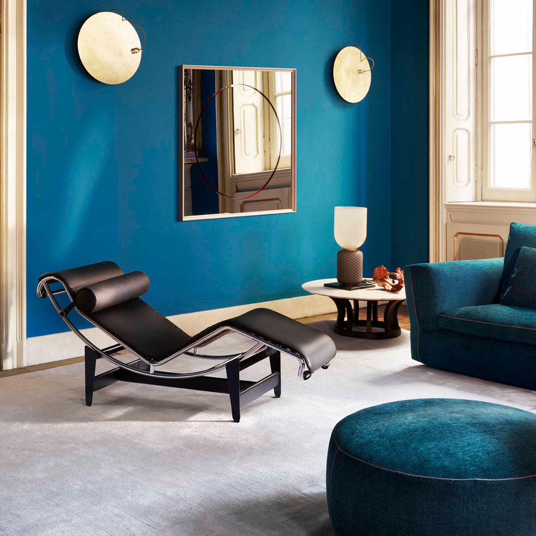
Even in the design, more care is taken with the use of colours, and there are new proposals for the classic blue. At Maison & Objet (Paris, January 2020), Chance, a Parisian design company, has proposed a complete blue collection consisting of tables, chairs, bookcases, rugs and wallpaper, all available in the classic blue variants.

Gio Ponti's use of “infinite blue' in the furnishings and ceramic floors of the renowned Hotel Parco dei Principi in Sorrento exemplifies his mastery of color. This choice not only enhances the aesthetic appeal of one of his architectural masterpieces but also demonstrates how his innovative use of blue contributes to the overall harmony and timeless elegance of the design.

Pantone's recognition of classic blue as the colour of the year is not merely a seasonal recommendation; it reflects a broader cultural narrative. As Pastoureau points out, colours convey deep-seated meanings and emotions that shape our lives in ways we might not consciously recognise. The enduring presence of classic blue in fashion, design, and architecture underscores its significance as a colour that, while aesthetically pleasing, also has the potential to facilitate personal and collective transformations. As we navigate our increasingly complex world, classic blue stands as a beacon of hope, stability, and creativity.
Cristina Morozzi